Ensuring mobile accessibility is critical for legal compliance and inclusive user experiences. This post provides practical implementation details for common Android a11y hurdles, like custom actions and semantic announcements, helping engineers build more robust, accessible apps.
A Voluntary Product Accessibility Template (VPAT) is a document that outlines how well a product aligns with accessibility (a11y) standards. Its primary purpose is to inform customers about a product’s a11y features, enabling them to make informed decisions before purchasing software.
At Slack, we conducted a VPAT by a third party a11y vendor in 2024 following our significant UI change (IA4). During this VPAT process, we identified a11y issues across Android, iOS, and desktop. Of the issues identified on Android, we immediately assigned the obvious shovel-ready issues, such as those with color contrast and missing image labels, to the responsible teams for resolution.
To address remaining Android issues, we conducted a comprehensive triage process. In this document, we take a look at the major recurring themes of Android accessibility issues and share resolution strategies and lessons learned in the hopes of helping others make similar improvements.
[Note:  for resolved and
  for future work.]
P1: Error messages are inaccessible P2: Headings are not identified P2: Missing a11y label on EditField P2: Incorrect number of items in list P2: Drag and drop in the workspace switcher is inaccessible P2: Strikethrough information not conveyed to screen reader users P3: Errors indicated by color alone P3: Keyboard Navigation and Focus
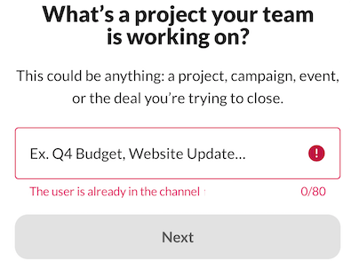
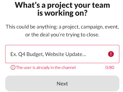
If the user enters an invalid input to an edit field and presses “Next” (or Submit), an error message is displayed, but the error is not communicated to users using screen readers. TalkBack should announce that it is in an error state when it receives focus, along with the error message so that users understand why it’s in error.
On Android, errors can be displayed to users in two primary ways:
|
(1) Immediately below the editing field.
|
(2) Via the SK error banner.
|
In both cases, TalkBack did not announce errors, so users must swipe through the screen to determine what occurred. For case (1), we modified OutlinedTextField so that the error is announced immediately below the editing field. For case (2), SKBanner for the error type was updated so that when an error occurs, the error is announced to screen reader users. The videos below illustrate the changes before and after using TalkBack for case (2).
|
Before
|
After |
The heading does not convey clear semantic information, making it difficult for screen reader users to quickly grasp the page’s structure and navigate efficiently. Defining headings enables assistive technology to convey the hierarchical organization of the content, enhancing accessibility and providing an alternative navigation method.
We identified and fixed issues with missing headings inside lists (such as in the Preferences page).
The vendor also suggested that titles in the top app bar should also be a heading, but we found that this pattern is not consistent with Android standards after testing other apps. Therefore, we closed those tickets.
Some edit fields do not have permanent labels. It is labeled using placeholder text that is removed when the user enters text. Some users with cognitive difficulties may forget the purpose of the edit field without a permanently visible label.
During our recent bug fixes, we encountered a few tricky cases that required collaboration with our design team and screen reader users. Specifically, we focused on our main search field and message input area (AMI). For AMI, space constraints prevented us from implementing an optimal solution. However, for the search field, we opted for a simple yet impactful change by adding an explicit search icon. This minor modification helps users easily identify the purpose of the edit field, significantly enhancing their overall experience.
|
Before
|
After
|
When TalkBack users have Always speak number of list items setting enabled and navigate through a list, TalkBack announces an incorrect number of items.
Our vintage Slack Kit (SK) Bottom sheet was the primary source of the issue. SK divider, although purely decorative, was considered an item within a list. For example, if the bottom sheet had 7 row items, including 2 divider items, TalkBack would announce “7 items in a list” instead of the intended “5 items in a list”.
To resolve this, we introduced a new SKListAccessibilityDelegate for SKListAdapter, overwriting the a11y CollectionInfo with the correct number of items.
Workspaces in the workspace switcher can be rearranged, but it requires the user to select a workspace and drag it to the new location. People who lack the dexterity required to perform this action may have difficulties completing the task, or may not be able to complete the task at all.
In discussions with the design team, we decided to implement an Edit mode in the workspace switcher. When a user enters Edit mode, a six-dot drag handle is displayed for each workspace row so users know that each workspace row has a drag-and-drop capability.
Additionally, we introduced custom actions (Move before and after) for TalkBack users so users can move each row item from the TalkBack context menu by three-finger tap on a row item or L or r drawing gestures.
|
Before
|
After
|
TalkBack custom actions to move a workspace up and down by one position.
Users have the option to format text as strikethrough, but the strikethrough information is not conveyed to screen reader users. It is visually evident that the text has strikethrough, but it is read as normal text for screen reader users.
During our conversation, we made a decision in consultation with a member of the blind community and agreed that the strikethrough format did not pose an issue. Most screen readers don’t interpret this format because doing so making it verbose and potentially confusing for screen reader users. They may interpret this strikethrough announcement as being part of the message itself.
As a general best practice, it’s recommended to avoid strikethrough format for accessibility reasons. Additionally, some sighted users may find it challenging to read.
If the user enters an invalid input to an edit field, an error message is displayed below the edit field. The only indication it is an error is that it is written with red text. To users unable to perceive red text, the error text is just another message on the screen and not necessarily an error.
We recently updated the design for displaying errors in edit fields, but there seems to be some inconsistency in its implementation. To address this, we conducted an audit of our usage and updated several screens accordingly. While it’s a relatively minor change, it improves the intuitiveness of understanding error messages.
|
Before
|
After
|
Through the process of triaging and addressing VPAT issues, we have gained valuable insights.
While the timing of our next VPAT assessment is yet to be determined, we are committed to continuously evaluating and improving the accessibility of Slack across all platforms. We hope you have gained valuable insights from this article.
| WCAG standard | Issue | Description |
| 4.1.2 Name, Role, Value (Level A) |  Error messages are inaccessible. Error messages are inaccessible. |
If the user enters an invalid input to an edit field and presses “Next” (or Submit), an error message is displayed, but the error is not communicated to users using screen readers. TalkBack should announce that it is in an error state when it receives focus, along with the error message so that users understand why it’s in error. |
| 1.3.1 Info and Relationships (Level A) | Heading is not identified. |
The heading does not convey clear semantic information, making it difficult for screen reader users to quickly grasp the page’s structure and navigate efficiently. Defining headings enables assistive technology to convey the hierarchical organization of the content, enhancing accessibility and providing an alternative navigation method. |
| 4.1.2 Name, Role, Value (Level A) |  Missing a11y label on EditField Missing a11y label on EditField |
Some edit fields do not have permanent labels. It is labeled using placeholder text that is removed when the user enters text. Some users with cognitive difficulties may forget the purpose of the edit field without a permanently visible label. |
| 4.1.2 Name, Role, Value (Level A) | Incorrect number of items in list |
When TalkBack users have Always speak number of list items setting enabled and navigate through a list, TalkBack announces an incorrect number of items. |
| 2.5.7 Dragging Movements (Level AA) | Drag and drop in the workspace switcher is inaccessible. |
Workspaces in the workspace switcher can be rearranged, but it requires the user to select a workspace and drag it to the new location. People who lack the dexterity required to perform this action may have difficulties completing the task, or may not be able to complete the task at all. |
| 1.3.1 Info and Relationships (Level A) | Strikethrough information not conveyed to screen reader users |
Users have the option to format text as strikethrough, but the strikethrough information is not conveyed to screen reader users. It is visually evident that the text has strikethrough, but it is read as normal text for screen reader users. |
| 1.4.1 Use of Color (Level A) |  Errors indicated by color alone Errors indicated by color alone |
If the user enters an invalid input to an edit field, an error message is displayed below the edit field. The only indication it is an error is that it is written with red text. To users unable to perceive red text, the error text is just another message on the screen and not necessarily an error. |
| [Not planned] Keyboard navigation and focus |
Continue reading on the original blog to support the author
Read full articleScaling notification systems requires balancing high-volume delivery with user cognitive load. Slack's rebuild demonstrates how architectural simplification and cross-platform consistency reduce technical debt and improve UX by making complex systems predictable.
Agentic testing shifts E2E focus from rigid journeys to goal-based verification. While too slow and costly for every PR, it provides a powerful exploratory layer that adapts to UI changes and handles complex state transitions where traditional deterministic scripts often fail.
This article demonstrates a practical approach to significantly improve CI/CD pipeline efficiency and developer experience. By intelligently caching and reusing build artifacts, engineering teams can drastically reduce build times and infrastructure costs.
This article highlights the practical challenges and solutions in integrating automated accessibility testing into existing frontend development workflows. It provides valuable insights for engineers looking to enhance their testing strategies without disrupting core framework functionalities.